Contiki Trip Page Redesign
I led my team in the redesign of Contiki’s trip pages, creating a unified, responsive experience that inspires travellers while improving clarity and conversion across all destinations.
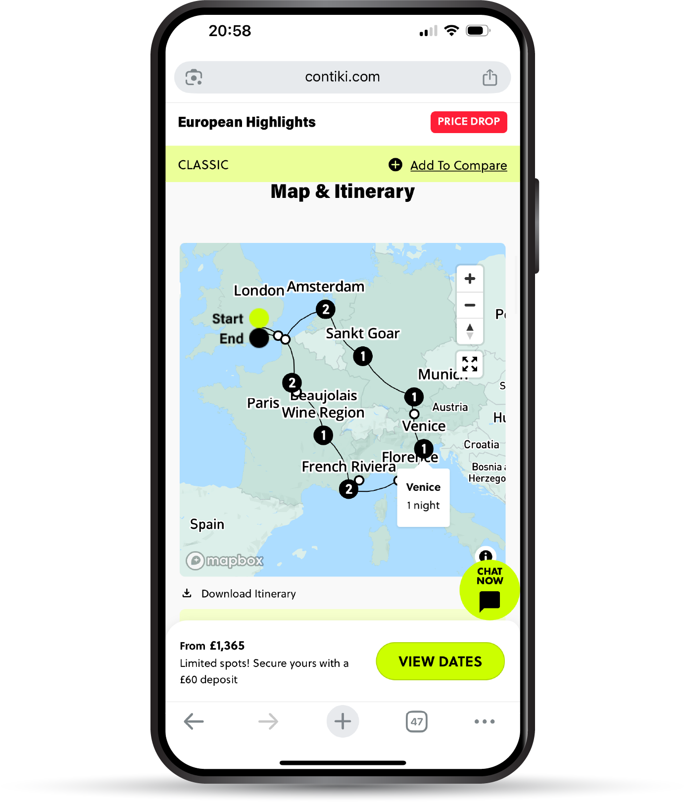
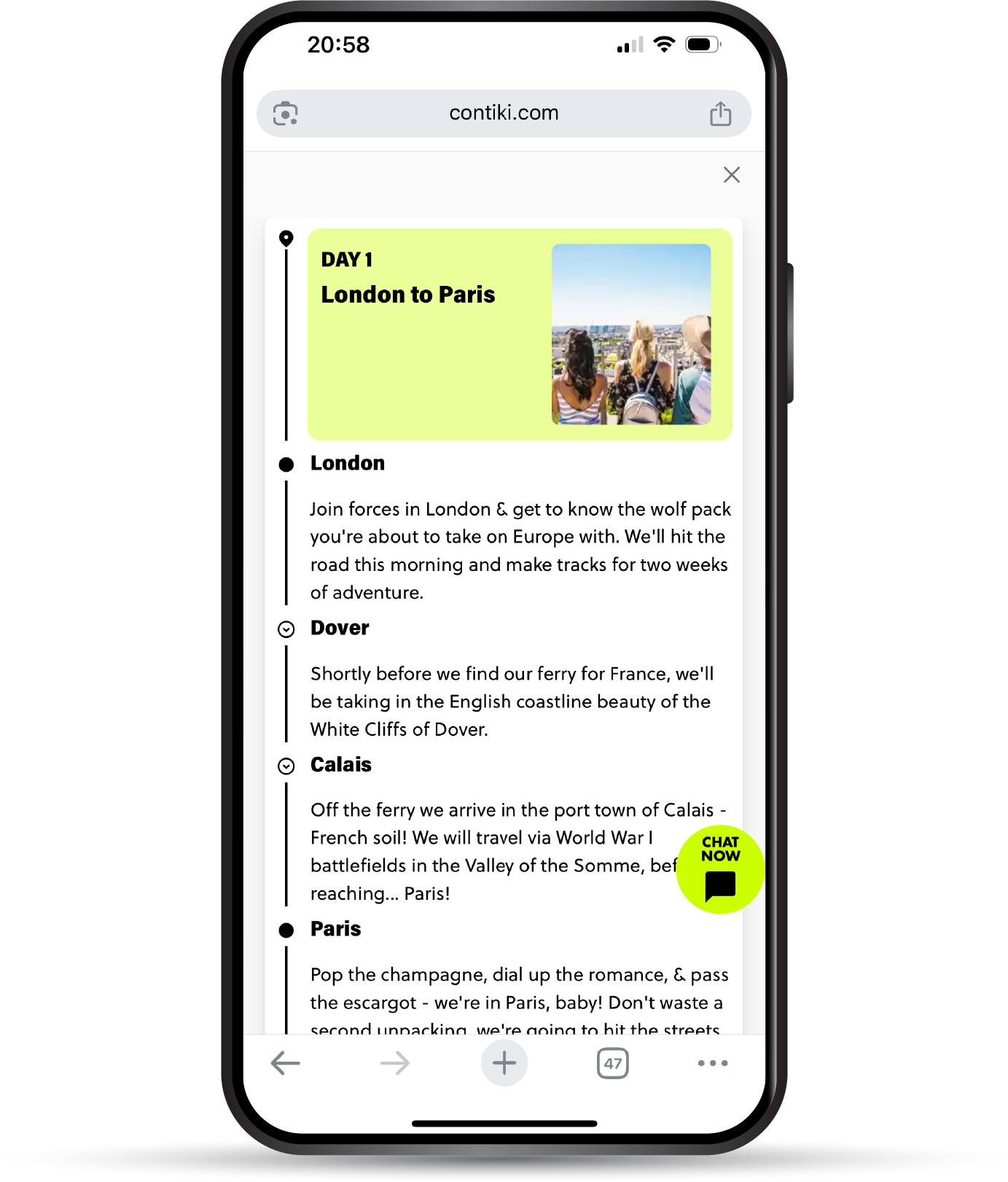
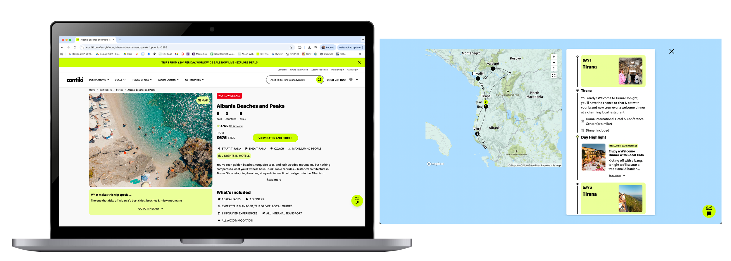
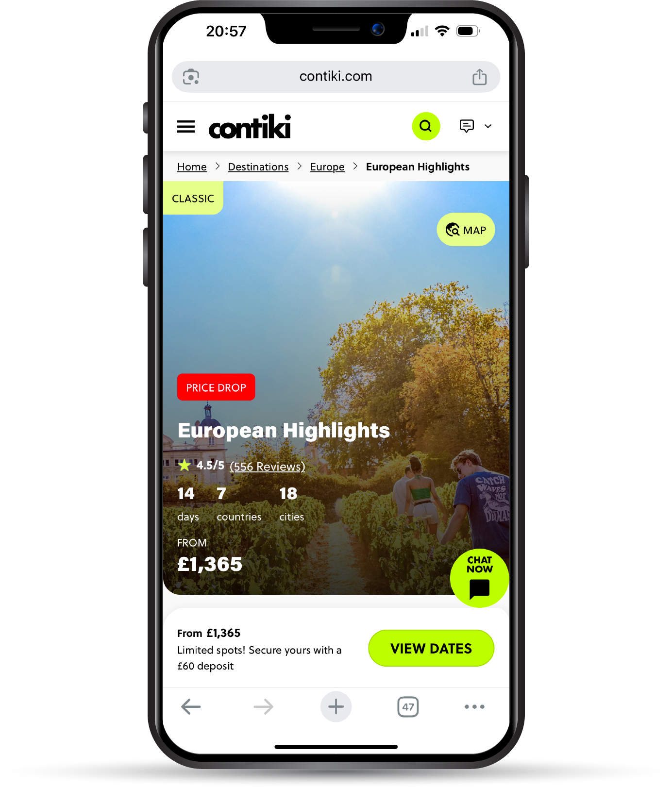
The challenge was to transform information-heavy pages into immersive, user-friendly storytelling experiences. The new design prioritises large, emotional imagery paired with concise, scannable trip details, duration, destinations, accommodation, meals, and group size, all presented through consistent iconography and typography.
UI Design Concepting Iconography Art Direction


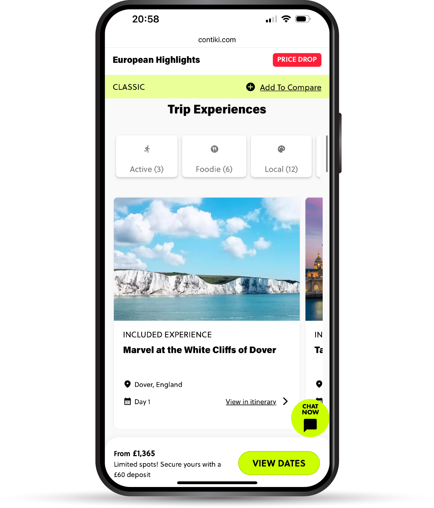
Icons
The icon system was adapted from Google Fonts’ Material Symbols and refined to suit Contiki’s refreshed trip page design. Each symbol was redrawn for consistent stroke weight, balanced proportions, and improved legibility across devices. The result is a cohesive, modern icon set that complements the brand’s bold, travel-focused aesthetic while helping users quickly scan essential trip details such as duration, transport, accommodation, and activities.